
The Pet Media Kit That Actually Gets Brands to Reply
A pet media kit brands actually read: the six blocks to put on page one, the numbers to lead with, and the pretty stuff that quietly gets you ignored.


The email I was not ready for
A brand emailed us and asked, very casually, “Can you send over your media kit?”
I did not have a media kit. What I had was a folder called final_FINAL_v3 and a very strong feeling that I was about to be found out. So I did what a lot of pet creators do: I opened Canva, picked the prettiest template, and spent most of a Saturday making eight gorgeous pages while Nicole and Nora slept on my feet in a single unmoving loaf.
I sent it. Then nothing. Not a no. Just the particular silence that makes you refresh your inbox like it owes you money.
It took me a long time and several more silences to understand what actually happened. My media kit was not too ugly. It was not too small. It was answering questions nobody at that company had asked.
Last time, I broke down the one sentence that makes brands actually “get” your pet page — the line that turns a cute account into something they can pitch internally. If you missed it, start here →
Real talk: the numbers below show what’s possible, not what’s promised. They’re an example of the upside this can create, and yours might be higher, lower, or slower. None of it is financial advice or a guarantee. My audience, though, is 100% real: ~12k Instagram, ~16k TikTok, ~45k YouTube, ~73k all in, built over roughly a year. And anything paid, gifted, or affiliate always carries a clear #ad / #sponsored label up top. That’s the FTC rule, and I follow it. 🐾
Nobody reads your media kit. They scan it and defend it.
Here is the thing I wish someone had told me before that Saturday.
The person opening your pet media kit is not a fan. They are usually a junior marketing coordinator with forty other kits open, a spreadsheet, and a boss who is going to ask them one question: why her?
They are not evaluating your aesthetic. They are gathering ammunition. Everything on your kit is either a bullet they can use in that conversation, or it is furniture.
Which reframes the whole document. A media kit is not a portfolio. A media kit is a one-page argument that a stranger can repeat out loud to their boss without you in the room.
Once I understood that, my eight beautiful pages became obviously, painfully wrong. Page one was a photo of my dogs. Page two was our “story.” Page three was a follower count. None of those are arguments. They are furniture.
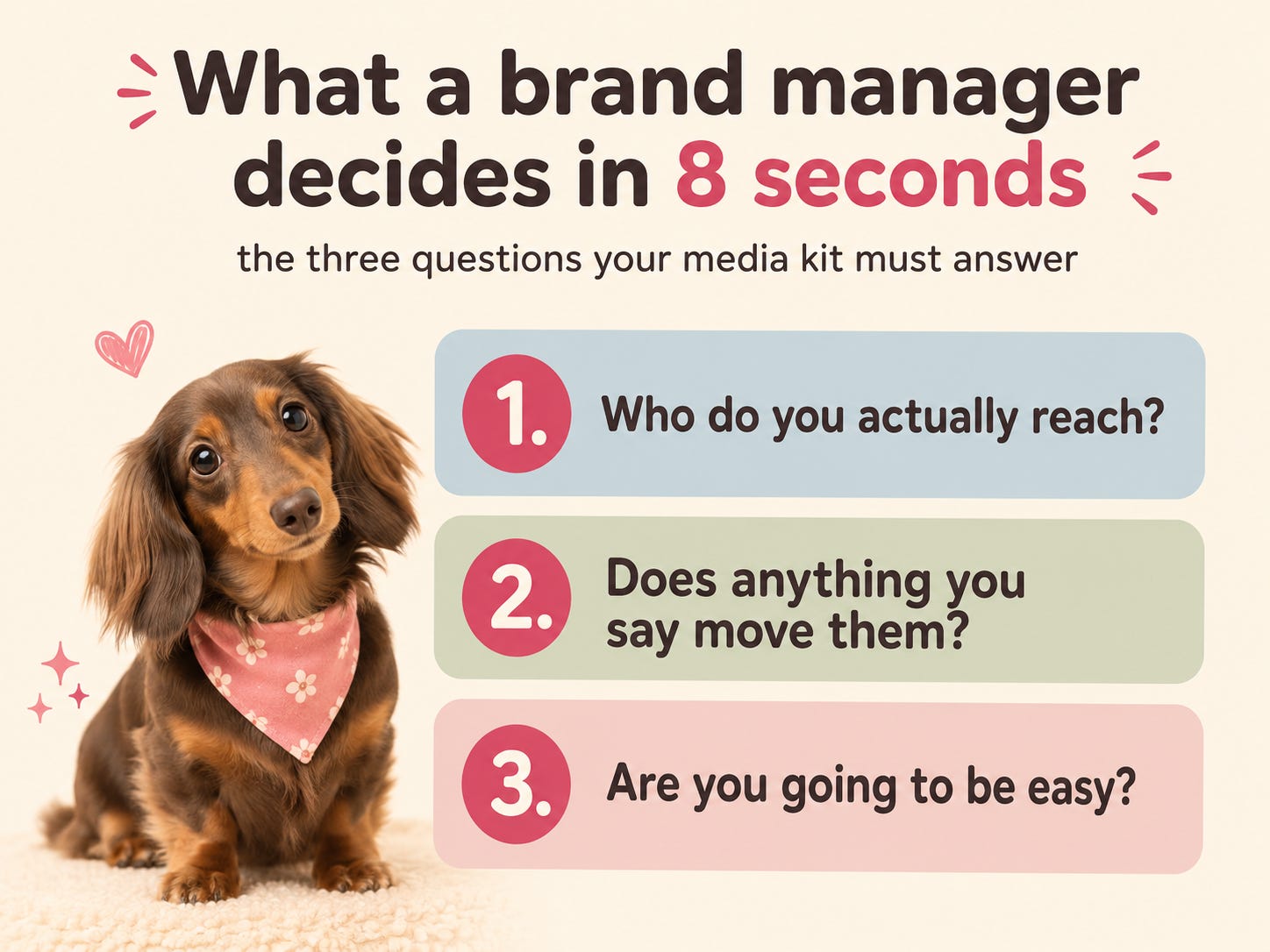
The three questions your kit has to answer
Every brand conversation I have been in since, paid or not, has come down to the same three questions. They are never asked directly. They are always being answered.
1. Who do you actually reach? Not how many. Who. “12k followers” is a number. “Mostly women 25 to 40 in US cities who own a small dog and buy for it like it’s a toddler” is a person their product is for. One of those goes in a spreadsheet. The other one gets repeated in a meeting.
2. Does anything you say move them? Reach is a claim. Engagement is evidence. A brand has been burned before by a big account that sold nothing, and they are quietly terrified of it happening again on their budget.
3. Are you going to be easy? This one is invisible and it decides more than the other two. Every brand has worked with a creator who missed the deadline, ignored the brief, forgot the disclosure, and made them look bad internally. Your kit is their first read on whether you are that person.
Here is your free takeaway, and it is the one that changed things for me: go look at your current media kit and ask which of those three questions each block answers. Anything that answers none of them is decoration. On my eight-pager, six pages were decoration. Once I cut them, the whole thing fit on one page, and that is when it started working.
The one-page rule is not about attention spans. It is about forcing you to choose. A page you cannot cut is a page you have not thought about.
If you want the sentence that goes at the very top of that page, I broke down the exact structure in the one-line fix that makes brands “get” your page. That sentence and this kit are the same argument at two different lengths.
🐾 Helping animals is the whole reason we’re here. If you’d like to help too, you can chip in to our shelter fundraiser for Animal Haven, and every little bit helps an animal in need. Join us. 🩷
💬 Tell me in the comments: has a brand ever asked you for a media kit and you panicked? I need to know I was not the only one refreshing that inbox.
And if you want to see the account all of this came from, we’re over on Instagram, TikTok, and YouTube. Two dachshunds, zero shame.
Knowing the three questions is the easy part. Actually building the page is where everyone stalls, because the internet will tell you to make it pretty and will not tell you what goes in which block, or in what order.
So below, I’m doing a full teardown of my own one-page kit, block by block, in the exact order a brand reads it.
The teardown: my one-page kit, block by block
This is the actual structure I use. Six blocks, top to bottom, in the order a brand’s eye travels. Nothing else on the page.
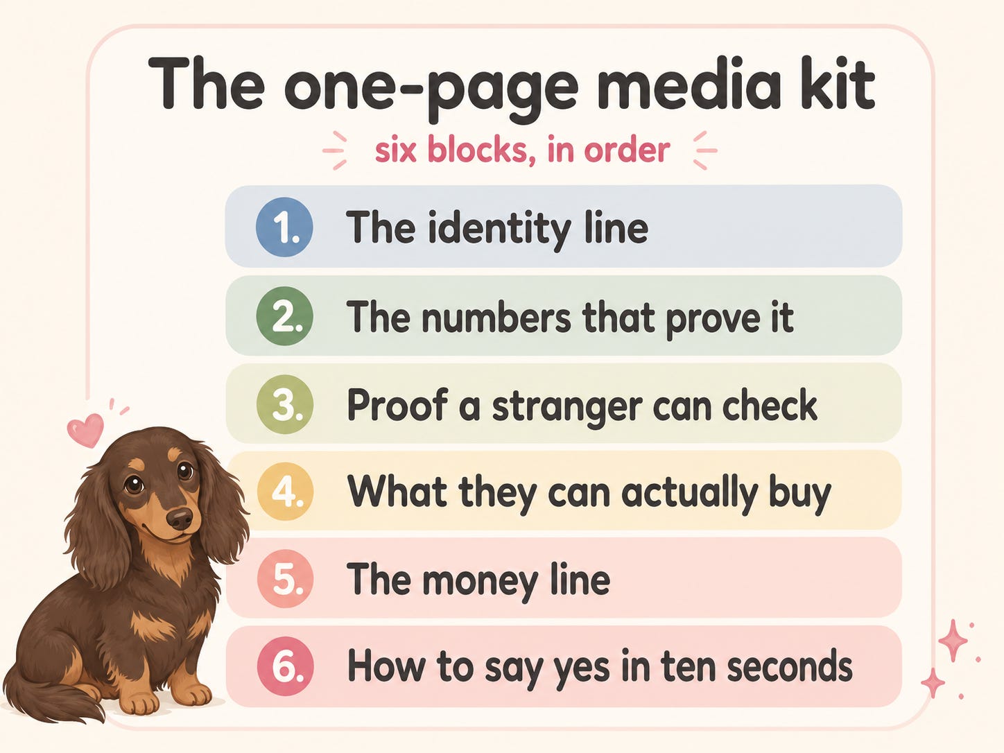
Block 1. The identity line (not your name)
What it is: One sentence at the very top. Not a logo, not a headshot of the dogs, not “Welcome to Nicole & Nora!”
Why it works: It is the sentence the coordinator copies into their spreadsheet. If you don’t write it, they write it for you, and theirs will be worse.
The honest catch: It has to describe the humans you reach, not the dogs you own. This is the most common mistake I see in pet media kits, and I made it for months. Brands do not sell to dachshunds. Dachshunds have terrible credit.
What I actually did: I rewrote mine from “Nicole & Nora are two mini dachshunds in NYC” to a line that names the audience and what I do for them. Same structure as the one-line fix post. Same argument, top of the page.
Block 2. The numbers that prove it
What it is: Your reach, per platform, with an engagement figure sitting right next to each one.
Why it works: A follower count alone invites the question “yes, but do they care?” A follower count with an engagement rate next to it answers that question before it gets asked. You are not showing off. You are closing a loop.
The honest catch: here is the contrarian bit. If your engagement is good, leading with follower count actively hurts you. Every guide says “lead with your biggest number.” I think that’s backwards for small accounts. A 12k account with strong saves is a better buy than a 200k account with dead comments, and the only way a brand learns that is if you put the two numbers side by side. Lead with the ratio, not the raw count. Big numbers make you comparable to people who will beat you. Good ratios make you interesting.
The number most creators leave out: saves and shares. Likes are a mood. Comments are a conversation. Saves and shares are purchase intent. Someone thought “I need to remember this” or “my sister needs this.” That’s the closest thing on a social platform to raising a hand in a shop. Almost nobody puts it on their kit, which means putting it on yours makes you look like you know something.
What I’d do: Three rows, one per platform. Followers, engagement rate, saves-plus-shares on a recent typical post. Not your best post ever. A typical one. Which brings me to the mistake.
Block 3. Proof a stranger can check
What it is: Two screenshots and one link. That’s the whole block.
Why it works: Anything you assert, they discount. Anything they can verify, they believe.
My honest mistake, and what it cost: on that first eight-page kit, I used my single best-performing post as the example. Of course I did. It was the one I was proud of. A brand replied asking what our “typical” numbers looked like, and I had to send a much smaller figure in a follow-up email, which made the first number look like a sales trick instead of a good day. That deal went nowhere. But the lost fee was not the real cost: I taught a brand to distrust my numbers in the first ten minutes.
The exact fix: I now show a median post, not a peak one, and I label it “typical.” Then, separately, I show the best one and label it “best.” Nobody has questioned my numbers since, because I questioned them first. Being the person who volunteers the unflattering number is a real competitive advantage, and it costs nothing.
Block 4. What they can actually buy
What it is: Two or three named packages. Not a menu of parts.
Why it works: A menu makes the coordinator do design work. A package makes them do procurement, which is their actual job. “1 Reel + 2 Stories + usage rights for 30 days” as a named bundle is something they can paste into a form. “Reels: from $X. Stories: from $Y. Usage: negotiable” is a puzzle, and puzzles get postponed.
The honest catch: three packages maximum. I tried five once. The reply asked me which one I recommended, which means I had made them do my job.
What I’d do: Name them plainly. “The Intro,” “The Campaign,” “The Season.” Then one line each on what’s included and who it’s for. Skip clever names. Clever names are for you, not them.
Block 5. The money line (and whether it belongs here at all)
What it is: the one block where I disagree with most of the internet.
Standard advice: always put your rates on your media kit, it filters out time-wasters. My take: it depends entirely on who’s asking, and the media kit doesn’t know who’s asking.
If a brand approached you, they have a budget and they want to know if you fit inside it. Rates help. If you’re pitching cold, rates on the kit anchor the negotiation before they’ve decided they want you, and you will almost always anchor too low, because you’re writing that number on a Tuesday when you feel small.
What I actually do: I keep two versions of the same one page. One with a rates block, one that says “Packages start at [X], full rate card on request.” Inbound gets rates. Outbound gets the range. It takes ninety seconds to maintain and it has saved me from underpricing myself more than once.
Illustrative math, not a promise: say a kit like this helps you convert two extra inbound conversations a year into paid work, and say those sit at $300 each. That’s $600 from a document you built once, on a Saturday, that costs nothing to keep. That’s the whole argument for spending an evening on it. Your numbers might be higher, lower, or slower. Results vary, and many creators take a lot longer than one Saturday.
If pricing is the part you’re stuck on, what a niche can bear changes what you can charge. That’s broken down in the profitable pet niches post.
Block 6. How to say yes in ten seconds
What it is: One email address. One next step. Nothing else.
Why it works: this is the block everyone forgets, and it’s the one that converts. The coordinator has decided they like you. Now make it physically impossible to lose you.
The honest catch: do not list five ways to reach you. Every extra option is a decision, and decisions are where momentum dies. One email. If you use a link hub like Linktree or Beacons, link it once, and make sure the media kit is the first thing on it.
What I’d do: End with a literal instruction. “Email me at [address] with your timeline and I’ll reply within 48 hours.” Then actually reply within 48 hours. That sentence is a promise, and the whole kit is an argument that you keep promises.
That is the whole argument, and it is yours whether you pay me or not. If it changed how you see your kit, that is the post doing its job.
Below the line is the part I use myself: the scoring and the skeleton, so you are not staring at a blank page tonight.
Inside the paid half, you'll get:
The 8-point scorecard to grade your kit before you send it again (mine scored 2)
The fill-in-the-blank kit you can copy line by line and have finished tonight
The exact places to send it — the marketplaces and networks I would actually use
What I would do differently if I were starting today with zero
Plus 30% off the $29 Petfluencer Playbook, paid subscribers only
And every paid post + the full archive
Come join me on the inside 👇
